How to tell a full substation from one with spare capacity (without calling the utility)
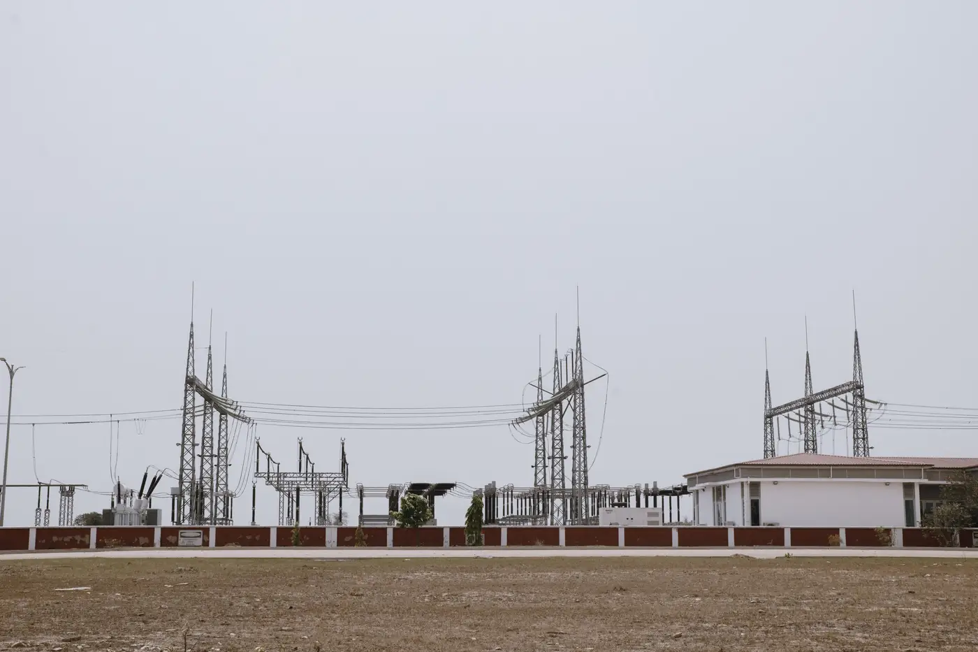
Every developer has burned a week waiting on a callback from an interconnection department, only to hear "we're full here" about a substation they could have ruled out from a desk. The utility will eventually tell you the real number. The question is whether you need that call before you've already walked three parcels near a dead-end bank.
A first read is possible before that call. It takes knowing where to look, and what the public data covers versus what it leaves out.
Start with the hosting capacity map
Most investor-owned utilities and a growing number of co-ops publish a hosting capacity map, usually a colored overlay on their GIS portal showing available capacity by circuit or substation bank. Green or dark means room. Red or orange means loaded, sometimes with a number attached, sometimes just a flag.
This map narrows your list. It doesn't settle the question. These maps are built for distributed generation interconnection, mostly solar under a few megawatts, and the numbers behind them get stale between refresh cycles. A substation that shows "limited" capacity for a 3 MW solar interconnection might still have headroom for storage, since BESS load profiles and curtailment options read differently to planning engineers than a straight generation injection. The map tells you which substations are worth a second look. It doesn't tell you the MW figure you'd actually bid against.
Cross-check against the interconnection queue
Every ISO and most utility transmission planners post a public queue, generator interconnection or small generator interconnection depending on size class. Pull the queue for the substation or the nearest point of interconnection and count what's already stacked up ahead of you.
A queue with four withdrawn projects and nothing active is a different story than one with two active storage projects already sized near the bank's rated capacity. Queue status won't give you a precise remaining-MW figure either, since requested capacity and studied capacity often diverge, and plenty of queued projects never get built. But a crowded queue at a substation that also shows red on the hosting capacity map is about as close to "don't bother" as you'll get without a phone call.
What the public data won't tell you
Neither source accounts for bank-level thermal limits that haven't been studied yet, planned upgrades already budgeted but not yet reflected on the map, or informal capacity a planning engineer is holding back for a specific customer. None of that shows up until you're in a pre-application meeting or a formal interconnection request, and by then you've already committed engineering time to the parcel.
What the public data is good for is ruling out the obviously full substations before you spend a site visit on land that was never going to interconnect. If the hosting capacity map is red and the queue is stacked, you've saved yourself a call. If it's green and the queue is thin, that's when picking up the phone starts to make sense, because now you're asking about a substation that's worth the planning engineer's time too.
Where land screening fits in
None of this tells you whether the land around a promising substation is flat, parcel-sized right, and already road-served, which is the other half of the screening problem before a site walk gets booked. Battery Storage Siting takes a shortlist of parcels within reach of a substation's spare capacity and checks them against those traits, so the parcels you bring to a planning engineer are the ones worth their time.
Run a substation's footprint through that screen before your next round of interconnection calls.